Lavender
#EADDF9
The app-icon field.


A light for the people you love.
A calm family care companion. The mark is a faceted hen with two chicks and an egg beside her — a household looking after its smallest members. Never a stock ♥ glyph, and never a bird lifted from an icon set.
Brand kit for internal / partner use.
01 · Mark
The hen-family icon beside the lowercase wordmark. Use it in the app shell, on the launch and auth screens, and anywhere the product needs to read as one word.
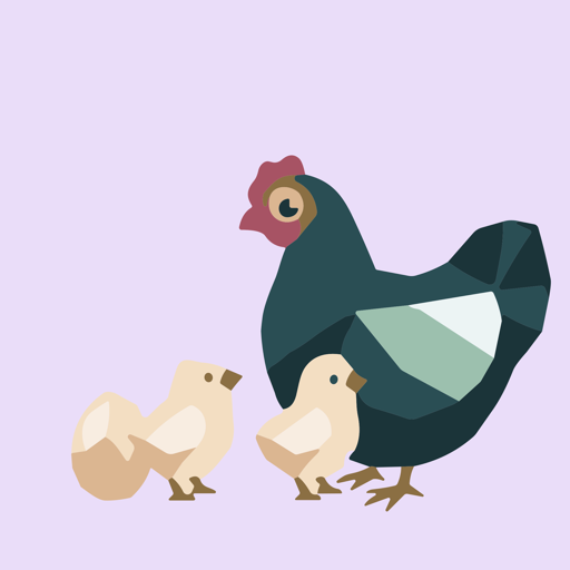
#2A4E54, sage and cream on a lavender field;
Ennichi is Paper cream, Ink navy and Chochin coral. So the mark reads as a
different palette from the screen around it — most visibly on the auth
screen, where a teal hen sits above coral buttons. This is a known,
accepted state: the assets were swapped without retuning the design
system. Don't “fix” it by recolouring the mark to a section hue.
The three you need in order to place the assets — the wordmark's ink, its
Night counterpart, and the field the app icon sits on. They are not
Ennichi tokens: nothing sits behind them in tokens.json, so they are
written literally and will not track ennichi.css. They live here, with
the mark, rather than in the palette below — filing them with the UI system is the
mistake the note above warns against.
This is not the illustration's full palette. The hen-family artwork
carries nine fills (ten in the icon), mostly browns, creams and a sage — read them
from design/svg/ if you need them. They are internal to the drawing:
you never hand-match them, because the artwork ships as a raster derived from those
masters. These three are the ones that appear outside the artwork, where
something else has to line up with it.
The app-icon field.
The one ink the wordmark ships in; also two of the artwork's fills.
The Night wordmark, recoloured from the day master.
The wordmark ships in one ink — teal #2A4E54.
It vanishes on the Night canvas, so the Night variant is derived by
recolouring that same master to Paper #EFE6D8. There is no
Chochin, Ramune or Ink colourway: don't invent one, and don't recolour
the wordmark to match a section.
design/svg/ by scripts/generate-brand-assets.sh;
never hand-edit a generated PNG. See docs/brand-assets.md.
02 · Colour
The product UI is built entirely from Ennichi tokens
(landing/ennichi.css, generated from tokens.json).
Every Ennichi swatch below is painted from its live token, so
those cannot drift from the system again. Hex values are listed Day / Night.
One swatch is deliberately not a token: Lavender is the
app-icon field, a brand-asset colour with nothing behind it in
tokens.json, so it is written literally and will not track
ennichi.css — if the icon artwork is ever recoloured, that
value has to be updated here by hand.
The screen canvas. Calm — never clinical white.
Hero-wash base only. Restrained emphasis.
Groups repeated rows. One card, Line dividers, no shadow.
Recessed controls — search fields, inset groups.
Primary text. Depth without coldness.
Secondary text and metadata.
Hairlines and dividers inside a card.
The label on Asagi and Ame fills — the two section colours light enough that white fails AA on them (3.36:1 and 2.55:1); InkOnBright reaches 4.67:1 and 6.15:1. Chochin, Ramune and Budo take white. Asagi is the caveat: 4.67:1 passes AA but scores APCA Lc 39.3 — readable by the ratio, not by eye — which is why buttons fill with Asagi Text rather than Asagi.
Each tab owns one hue for its whole screen — the section is fixed by the screen, not chosen by the user. One dominant section family per screen. The action hue follows the surface’s section: Chochin is the default, and a Today surface takes Asagi Text instead.
State only, and mutually exclusive: Taken / On track / Valid use Positive, Due now / Expires soon use Attention, and missed / expired / overdue use Critical. Never decoration, never brand chrome.
Taken · On track · Valid.
Due now · Expires soon.
Missed · Expired · Overdue. Also destructive actions.
Paper (3) · Ink (2) · one section accent (1). A screen carries a single dominant section family; entity colours (patient, medicine, doctor, facility) are compact identity accents only — never navigation, never large surfaces, never actions.
03 · Rules
generate-brand-assets.sh